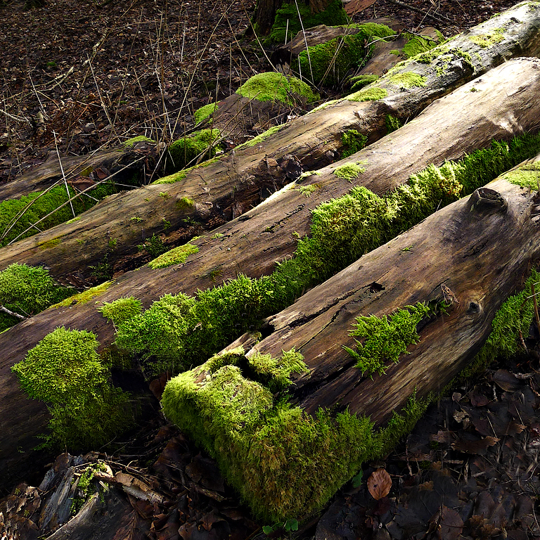
Gosh, a personal invitation to critique one of Nina's pictures.

The photo appears to be in the same orientation as originally posted, but for me the diagonal as shown works best as it encourages the eye to rest at bottom right. When flipped horizontally, the eye is being taken from bottom left to top right and the bottom right is not working. I am not sure that the square format works best here as it means that there is a fair bit of space with nothing much interesting in it at top right - it just does not add anything for the viewer. I would also be tempted to bring down the tones a bit at top left as they are a bit bright and are a distraction.
There is a lot of clutter along the top and bottom, so I would be very tempted to simplify the composition by removing these to concentrate on the main elements, these being the strong diagonal and the vivid green of the moss. At that point, the horizontal flip does enhance things as the eye is lead along its natural inclination.

- Suggested crop - original orientation
- original.jpg (170.91 KiB) Viewed 4399 times


