Page 1 of 1
Staircase
Posted: Wed 22 May 2019, 10:13
by Paul Heester
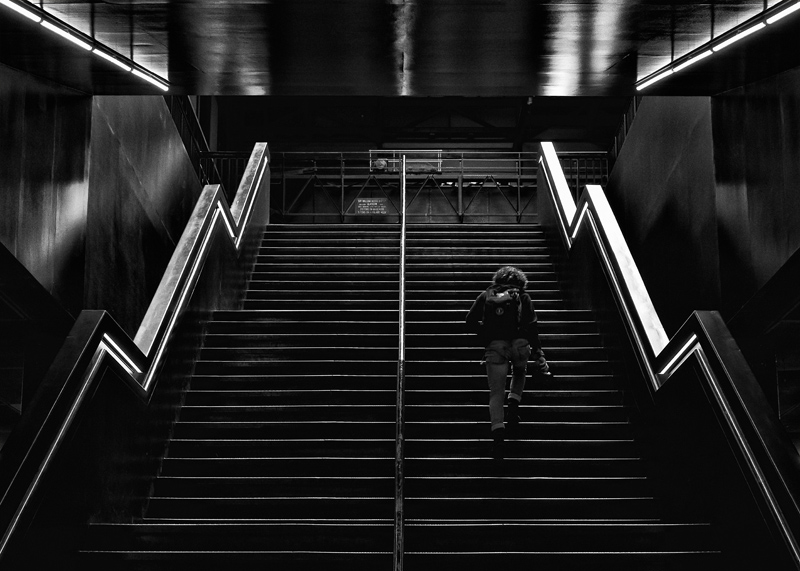
Recent shot but once again not sure if its got the interest for the viewer. I did stay around for a while waiting for people to walk up and down and having a single person seemed the best option.

- IMG_0397.jpg (207.98 KiB) Viewed 115500 times
Re: Staircase
Posted: Wed 22 May 2019, 16:18
by Peter Boughton
I'm not sure why you're not sure, it's a perfectly good image. Also it might be one that looks even better when projected.
I would experiment with flipping the person, and possibly removing or darkening the text on the sign so it's less distracting, but those are relatively minor things.
Re: Staircase
Posted: Thu 23 May 2019, 12:18
by Paul Heester
Thanks for the comments Peter. I had originally darkened the whole of the sign and gangway but felt the person was walking into a black hole! But agree just removing the sign would help. The right staircase is practically blown out as well which unbalances the shot somewhat. It was processed using Silver Efex so I could easily play around with it again.
Peter Boughton wrote:I'm not sure why you're not sure, it's a perfectly good image. Also it might be one that looks even better when projected.
I would experiment with flipping the person, and possibly removing or darkening the text on the sign so it's less distracting, but those are relatively minor things.
Re: Staircase
Posted: Fri 24 May 2019, 16:43
by Peter Boughton
Yeah, having the top too dark wouldn't be good. Fixing the blown highlights should be simple - I've not used Silver Efex but it seems control points could do it, or there's several other ways in Lightroom/Photoshop/equivalents if they don't.
Re: Staircase
Posted: Tue 28 May 2019, 19:13
by Mike Farley
An intriguing symmetrical assymetric shot. Or should that be the other way around? Paul has already spoken about darkening the handrail on the right, but I would also look at the other bright tones, especially at the top. As we all know too well, judges always comment about highlights at the edges and away from the main subject being a distraction. If it started off as a Raw file, depending on whether the application used supports local adjustments, I would make the changes at the conversion stage rather than later on. The Lightroom Radial filter, inverted, is a very useful tool for the purpose of altering local tonailty. It is often better in that regard than the Adjustment Brush, in my opinion.
Personally, I would tone down the sign a bit but not remove it altogether since it does add to the assymetry, which is a strong feature of the composition. I am not sure if the figure really jumps out sufficiently to make it the obvious centre of attention. Allowing that this is a low resolution JPEG, it is difficult to tell with certainty. It might look different projected or printed, but I would experiment with lightening the darker tones, as well as playing with the clarity and contrast. The position is OK. Flipping the shot leaves a large space on the right where the eye usually expects to find something and it looks empty. It would make the central handrail more dominant and could well provoke the "two images" comment.
The big question is whether it would earn a certificate in a club competition. Given the propensity of judges to shock and surprise (more usually the former than the latter), I am not sure. For me, it is subtle rather than an obvious standout and could go either way. Moreover, it falls within the street photography genre, which often does not do well. Much would depend on what else was on display and maybe even whether the judge had an unstressful journey to the meeting that night.