Exif -
1/6th sec
f2.8
100mm (macro)
ISO 100
Critique please!
Dandelion by cedarsphoto, on Flickr
Dandelion
-
- Posts: 47
- Joined: Sat 13 Oct 2012, 15:09
- Location: Horsham
- Contact:
Re: Dandelion
Very nice, very subtle!
Did you burn the edges??
Lovely sharpness in the middle! Love the mono conversion!
Did you burn the edges??
Lovely sharpness in the middle! Love the mono conversion!
Re: Dandelion
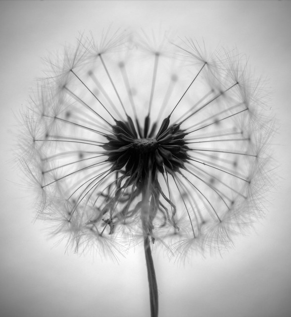
I used a hand held torch off camera to get the lighting and vignette how I wanted but it wasn't as pronounced as I hoped so added a touch more in ACR. Focused manually on the head using live view + mega zoom to get it as sharp as possible but even so at f2.8 the area in focus was teeny so sharpened it even more in PS afterwards. Quite pleased with the outcome
Tried another dandelion with a more "full" head of seed but the extra stalks really got in the way and cluttered things up. Having a few missing improves clarity a lot.
Re: Dandelion
ooh I've just noticed a blemish I can clone out too
-
- Posts: 7316
- Joined: Tue 11 Sep 2012, 16:38
- Contact:
Re: Dandelion
Hi David
I can see what you were trying to do and it was a good decision to use a wide aperture so that only the central part of the dandelion is in focus, as was the vignette. That definitely concentrates the eye on the central mpart of the dandelion, but the image seemed a bit flat to me. Since I could not download the image from Flickr, I made a screen print and played around with it in Silver Efex Pro 2. The result which I shown here is the Fine Art High Key preset, with the frame effect removed. To me, this has given the image the drama it deserves by boosting contrast, emphasing the centre more and enhancing the ring of in focus seed heads.
Incidentally, all digital images tend to be a bit soft straight out of the camera and all need sharpening to one extent or another.
- Attachments
-
- Dandelion.JPG (104.51 KiB) Viewed 8788 times
Re: Dandelion
I think the difference it's made to the head of the dandelion is very interesting, and very pronounced. Quite like that it's brought out more detail. It almost looks like mono HDR?
Maybe it's an artefact from the source image you used but I don't like the banding it's introduced on the vignette and the bokeh for the rearmost seeds is really distracting - they've gone from fairly diffuse orbs that you can see when you look, to clearly defined circles.
I really must renew my silver efex pro trial though. Maybe put it on a Christmas list too!
Thanks for the feedback, I didn't see your reply in time Mike but expect to see this image tonight
-
- Posts: 7316
- Joined: Tue 11 Sep 2012, 16:38
- Contact:
Re: Dandelion
davidc wrote:I think the difference it's made to the head of the dandelion is very interesting, and very pronounced. Quite like that it's brought out more detail. It almost looks like mono HDR?
Maybe it's an artefact from the source image you used but I don't like the banding it's introduced on the vignette and the bokeh for the rearmost seeds is really distracting - they've gone from fairly diffuse orbs that you can see when you look, to clearly defined circles.
I really must renew my silver efex pro trial though. Maybe put it on a Christmas list too!
Thanks for the feedback, I didn't see your reply in time Mike but expect to see this image tonight
The Silver Efex Pro processing was done on a quick and dirty basis to give an idea of what is possible with the image. Given that I did not have an ideal source to work with, it is quite likely that some unsightly artefacts were introduced as a result. Certainly I have not seen SEP do this on any of my images. SEP has a "Structure" function which does something with the contrast to bring out detail and as you have seen, the effect can be very striking. It is is definitely the go to application for anyone serious about mono as it is capable of quickly producing very good results.
I look forward to seeing the image tonight and how it gets on.
Re: Dandelion
Well, you were right about the centre of the image! Frustratingly it did print darker than the digital version but by then I was too late. I didn't agree AT ALL about the vignette though, felt that was an incorrect assessment. Also felt the marking was somewhat inconsistent but hey, I like it
-
- Posts: 7316
- Joined: Tue 11 Sep 2012, 16:38
- Contact:
Re: Dandelion
davidc wrote:Well, you were right about the centre of the image! Frustratingly it did print darker than the digital version but by then I was too late. I didn't agree AT ALL about the vignette though, felt that was an incorrect assessment. Also felt the marking was somewhat inconsistent but hey, I like it
I quite liked the image when it was put up as a print last night and it had more of an impact than it did on the screen. You are right that it printed darker, which can happen if you do not have full colour management in place. If your monitor's brightness is set too high, for example, then it will not give a realistic impression of how images will look when printed. Also bear in mind that photos are taken with and displayed on screen with RGB devices, i.e. the colours are from from combinations of red, green and blue. On screen, they are illuminated by backlit lighting. Prints are made using the CMYK process, i.e. combinations of cyan, magenta, yellow and black (K) and are viewed by reflected light. Not only that, contrast is lower than on screen. Getting the two to match is not always straightforward!
Regarding the vignette, which also was darker than the digital version shown here, it can be an acquired taste and often less is more. If it is noticeable, then you have probably overdone it and applying it more subtly can often produce a better overall result. At a subconcious level, the eye and brain will still pick it up but not to the extent that it becomes obtrusive.
If you do your own printing and an image does not come out as you wish, you have the option to make adjustments and do it again. It is worthwhile to give the print a few minutes to dry completely before making any alterations as colours can change during that period.
One of the reasons why I could never be a judge is that assessing an image is very subjective and opinions will always vary between individuals. What I look for is someone who can give a critique which justifies the eventual mark by highlighting what they see and any improvements they feel are necessary. If you have ever seen a competition where there is more than one judge, it is actually very rare that each will give an image the same score and the variation can sometimes be quite large.
Re: Dandelion
The image appearance compared to the digital version is one thing that is currently confusing me - I have a colour managed, brightness balanced monitor calibrated every couple of weeks and using printer profiles supplied by the paper manufacturer using printed examples I sent to them. So it's as accurate as it possibly can be... yet STILL something isn't coming out quite right!
I've decided to start printing images at 6" x 4" first to get an idea what they're coming out like instead, then adjust.
r.e. the judging, last night I thought he was very good in terms of the critique and comments given and I found in almost all cases for the print competition, my own thoughts agreed with his. Digital less so, for some reason. But with the marking in many cases I don't think the positive critique he gave for an image was reflected in a suitable mark - particularly considering the massive number of 10+ scores he gave out! Overall I think he's one of the best judges we've had though, definitely, particularly in image feedback.
Who is online
Users browsing this forum: No registered users and 18 guests