Well.... I've spent WAY more time thinking about this than I probably ought to have! Even roped my wife in who said "aren't they the same", then rolled her eyes when I pointed out the details and eventually she chose Mike's

As for me.... I'm afraid I'm on the fence for this one but at least I can explain why!
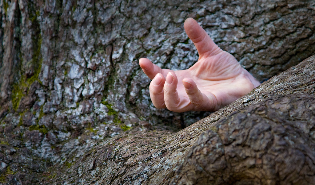
Nina's image - I like the tones of the hand and especially the green moss on the tree to the left and think the extra space helps it out. Like Mike though, once I noticed the OOF bottom right corner it detracted slightly.
Mike's image - I like the contrast and tones in this one and *think* I prefer the overall composition; I've been swinging between the wider shot of Nina putting more context as to where the hand is vs. Mike's tighter crop with focus on the interest element, the hand.
So sorry everyone but it's a tie for me
Still, it was fun to see you both tackle the exact same subject and come up with different results. Mike maybe you and I should do that for a 365 day sometime, others welcome to join of course. Seeing how people view a scene and choose to render it to the viewer could be a good learning exercise, maybe even for a club night sometime?
You can both have a gold star for effort